Let’s know default way how use flex attribute in css
1. Default setting
Firstly, we sould create the html code for testing.
flex.html
1 | <html> |
and let’s define background-color attribute and size attribute to know how flex attribute is operated.
flex.css
1 | .parent { |

2. flex container, flex item
flex attribute is consist of two elements. the one is flex container and the other is flex item. their relation is parent-children as you guess.
to use flex attribute, you should define ‘display: flex‘ attribute in parent element (= flex container)
flex.css
1 |
|
then the children element in parent can use flex attribute. and html basically render data from top to bottom but if you apply flex attribute, it will be change to horizontal.

3. flex-direction
flex attribute basically change aligning direction from left to right.
if you want to change it, you just modify flex-direction attribute. this attribute default value is row. to set aligning direction from top to bottom, change it to column.
1 |
|
if you align the data reversely then type row-reverse or column-reverse at flex_direction
1 |
|
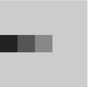
flex-direction: row

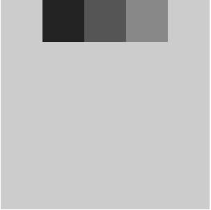
flex-direction: column

flex-direction: row-reverse

flex-direction: column-reverse

4. justify-content
justify_content attribute in flex is for defining to align way at horizontal direction.
you can set with this attribute where it places like left or center, how much it has free space and how it sets ratio between each free space.
children elements will be applied when you define this attribute in parent element (= flex container)
1 |
|
the above attributes (flex-start, flex-end, center, space-between, space-around) usually used in real.
1 |
|
justify-content: flex-start

justify-content: flex-end

justify-content: center

justify-content: space-between

justify-content: space-around

4. align-items
unlike justify-content attribute, align_items attribute can defines vertical aligning.
1 |
|
1 |
|
align-items: stretch

align-items: flex-start

align-items: center

align-items: flex-end

You should remember the stretch attribute set same the height with flex-container. but if you define the height at children element then the stretch attributle is ignored.
1 |
|
in my experence, flexbox in css is not usually used in real service. because old browsers don’t support this attribute. so you should also know about how can solve same problem without flexbox.